Branding Design at 35,000 Feet
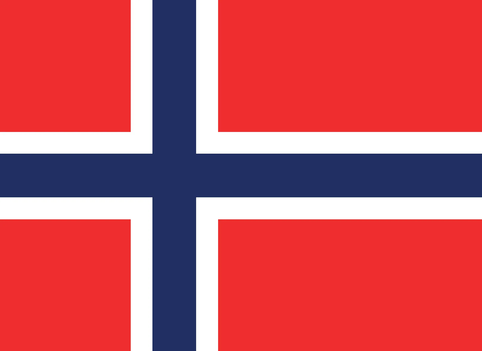
Challenge: Norwegian Airlines is a household name—familiar, respected, and deeply rooted in Scandinavian culture. But even legacy brands must evolve. The challenge was to refresh the visual identity of this aviation giant while preserving its Nordic essence. The branding had to feel premium yet approachable, timeless yet ready for the next generation of travellers.
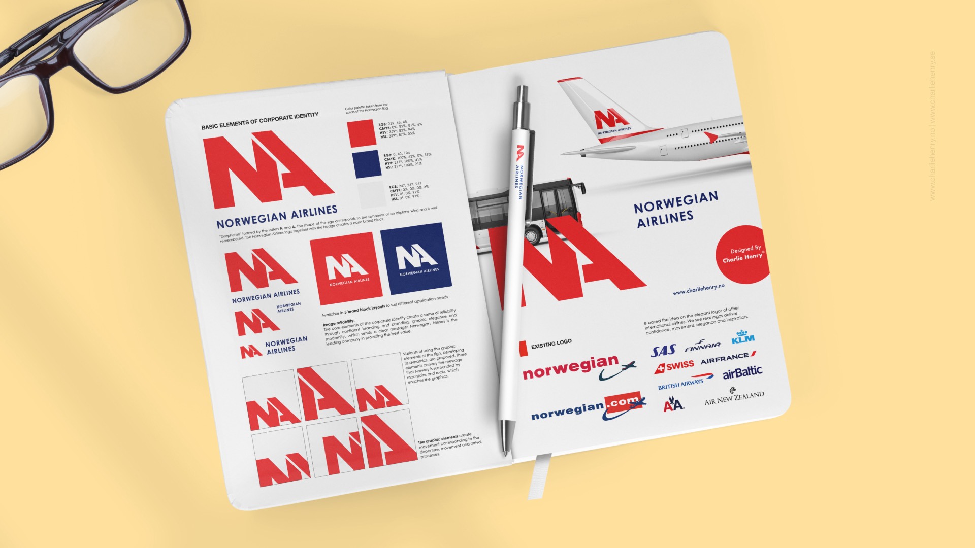
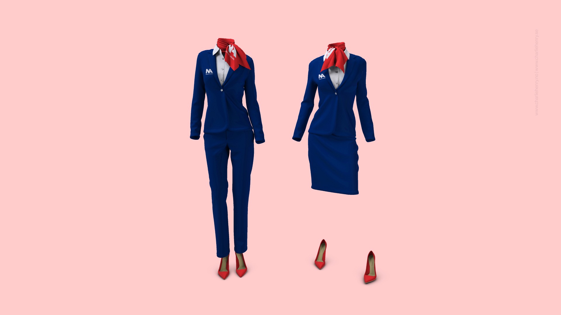
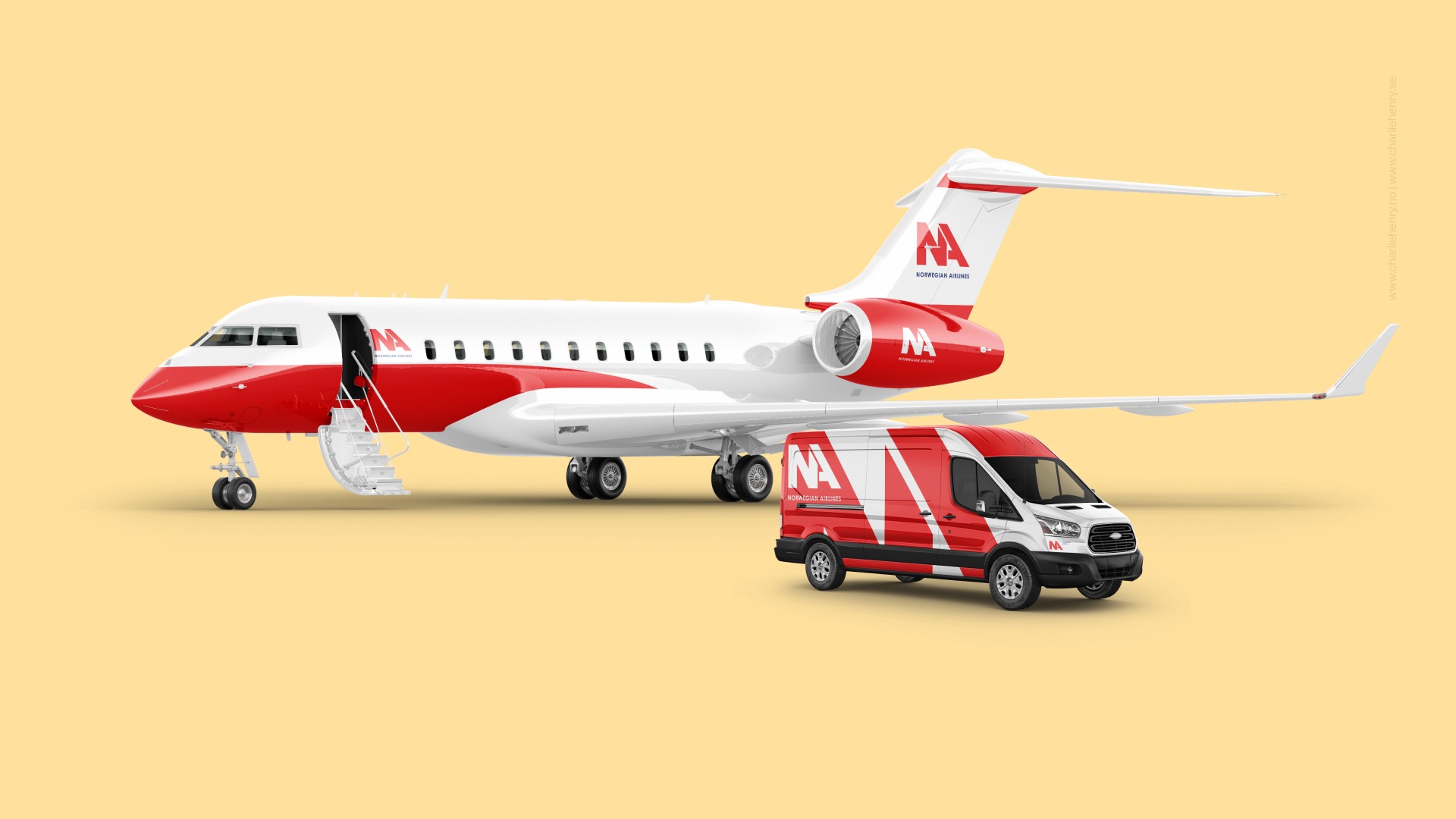
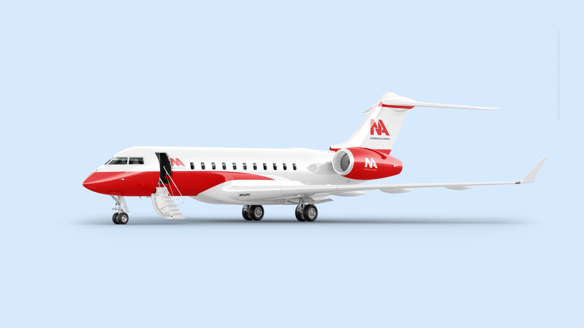
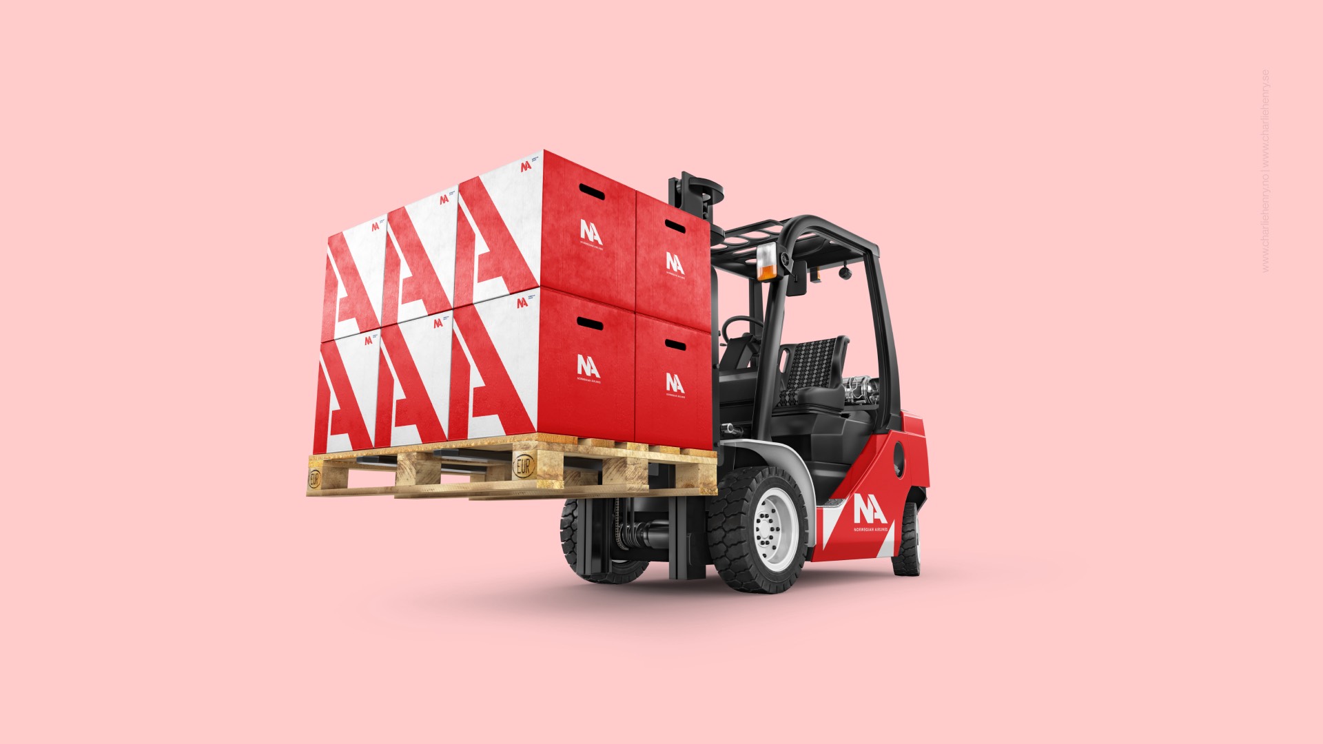
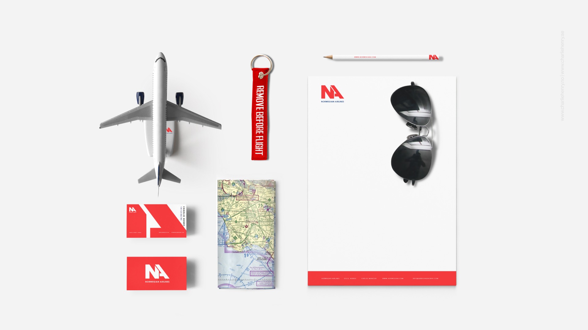
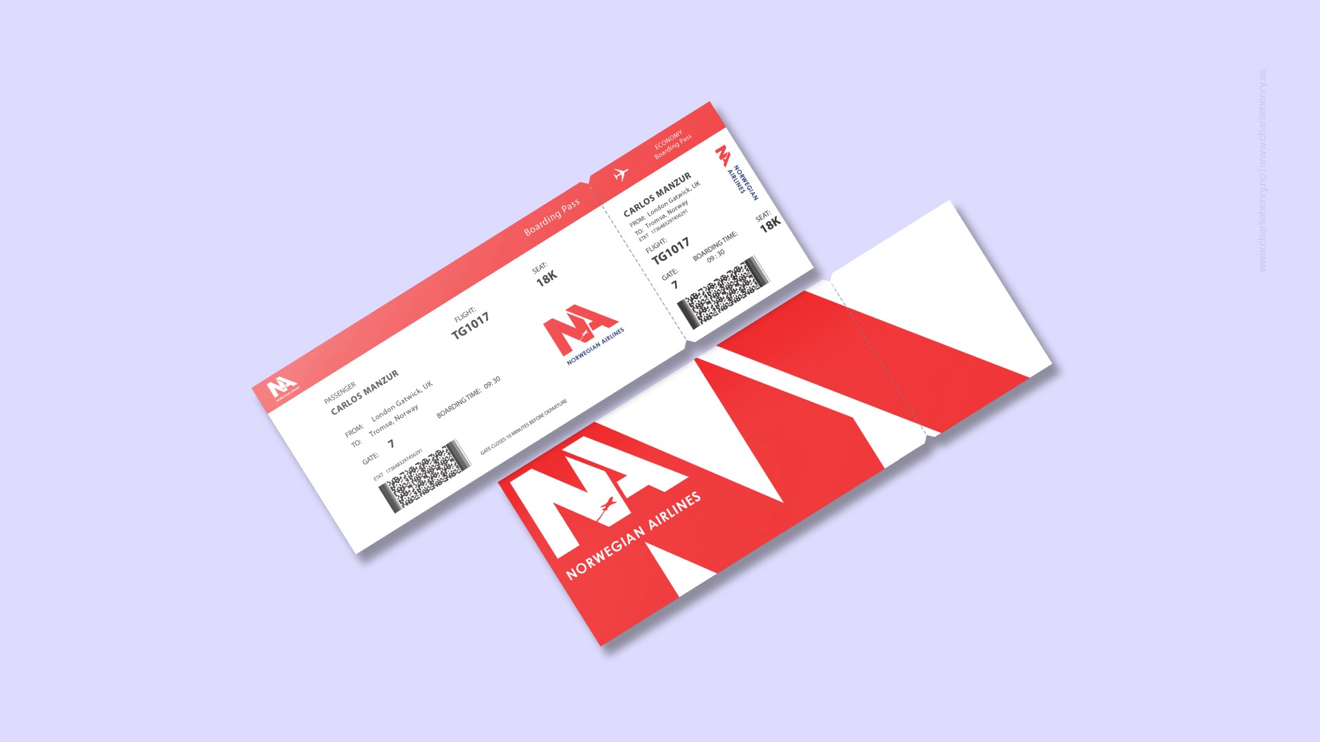
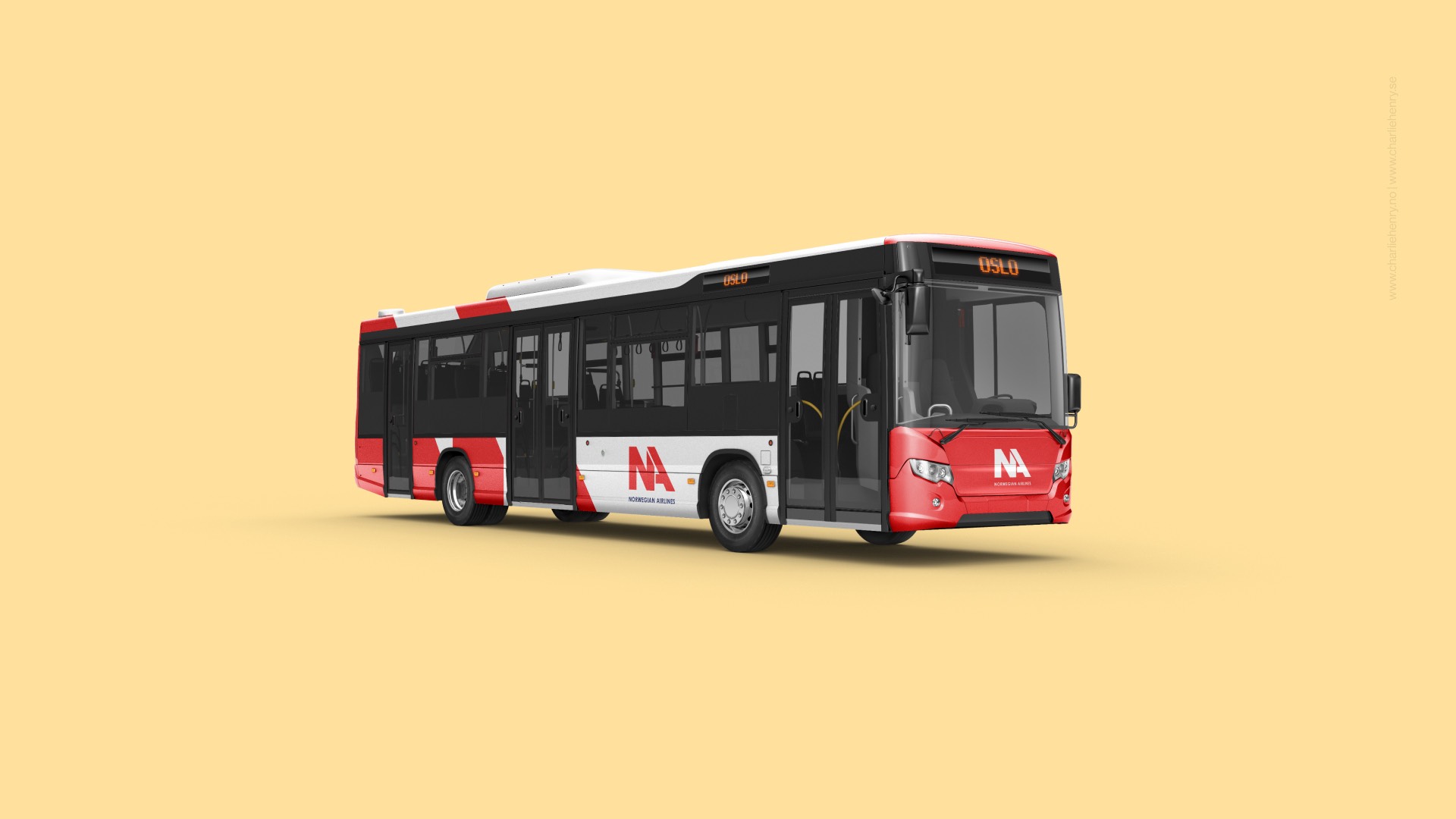
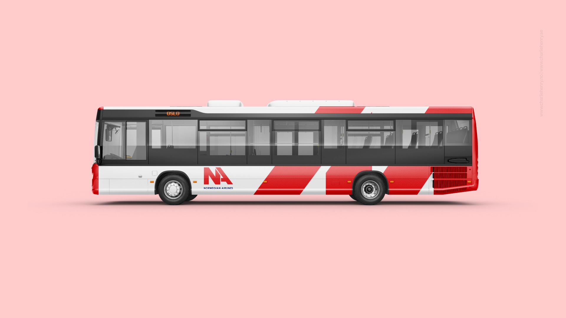
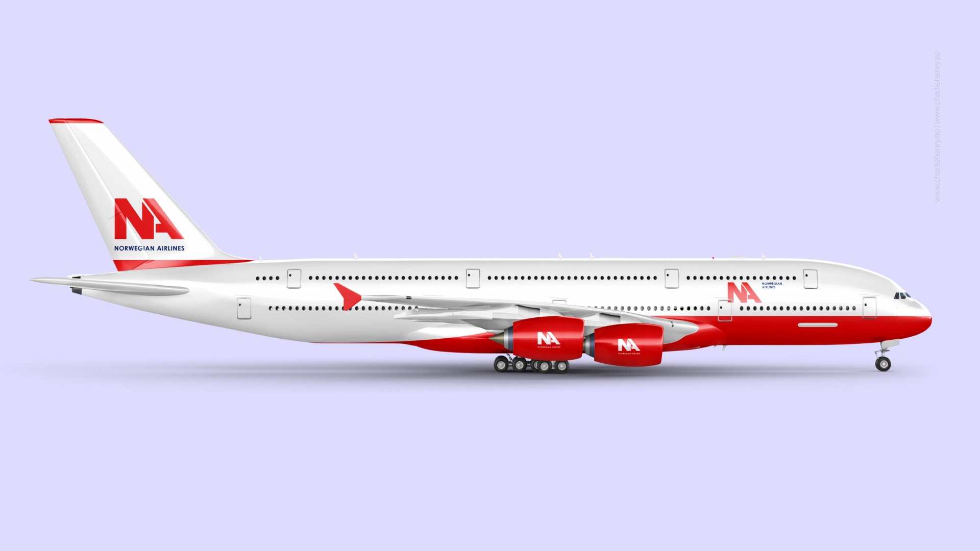
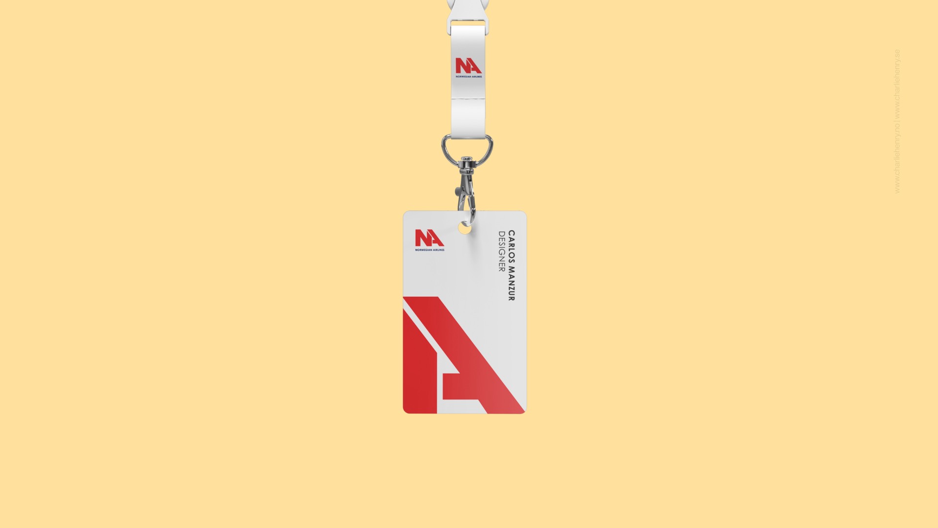
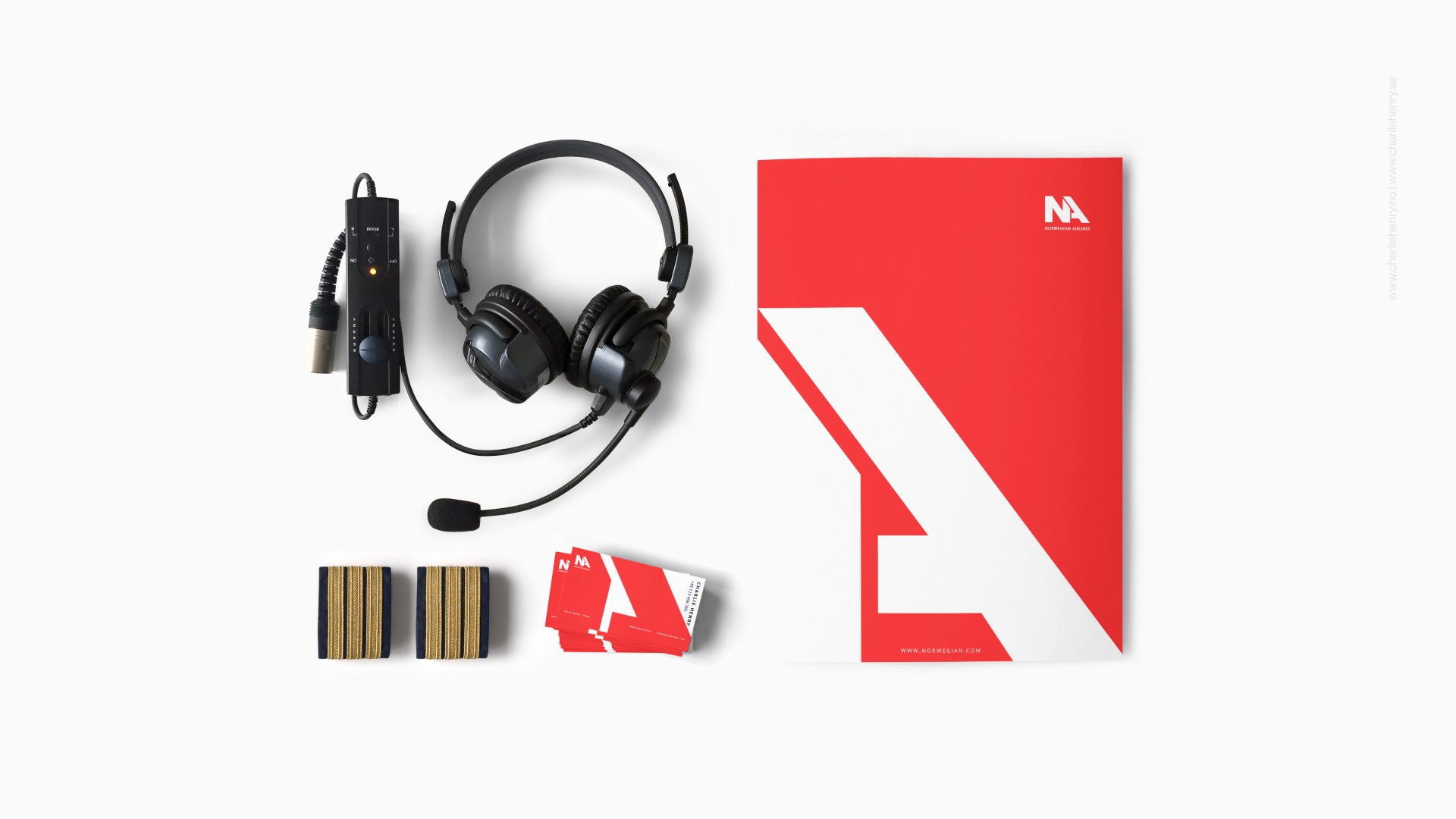
Solution: From initial research to execution, I redefined Norwegian Airlines' brand presence through a complete visual identity system. This included:
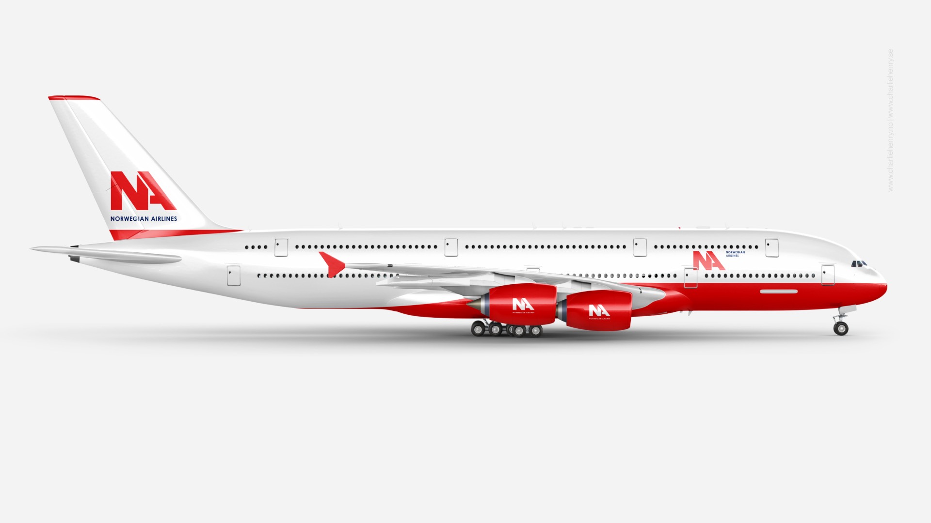
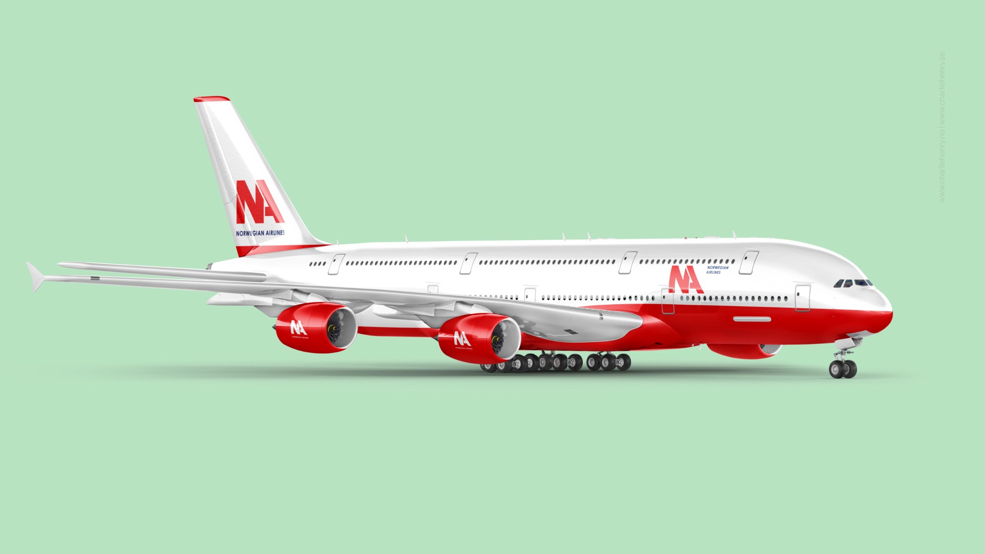
- Crafting a modern logo direction rooted in Scandinavian geometry and minimalism
- Developing a cohesive brand palette, typography system, and layout logic
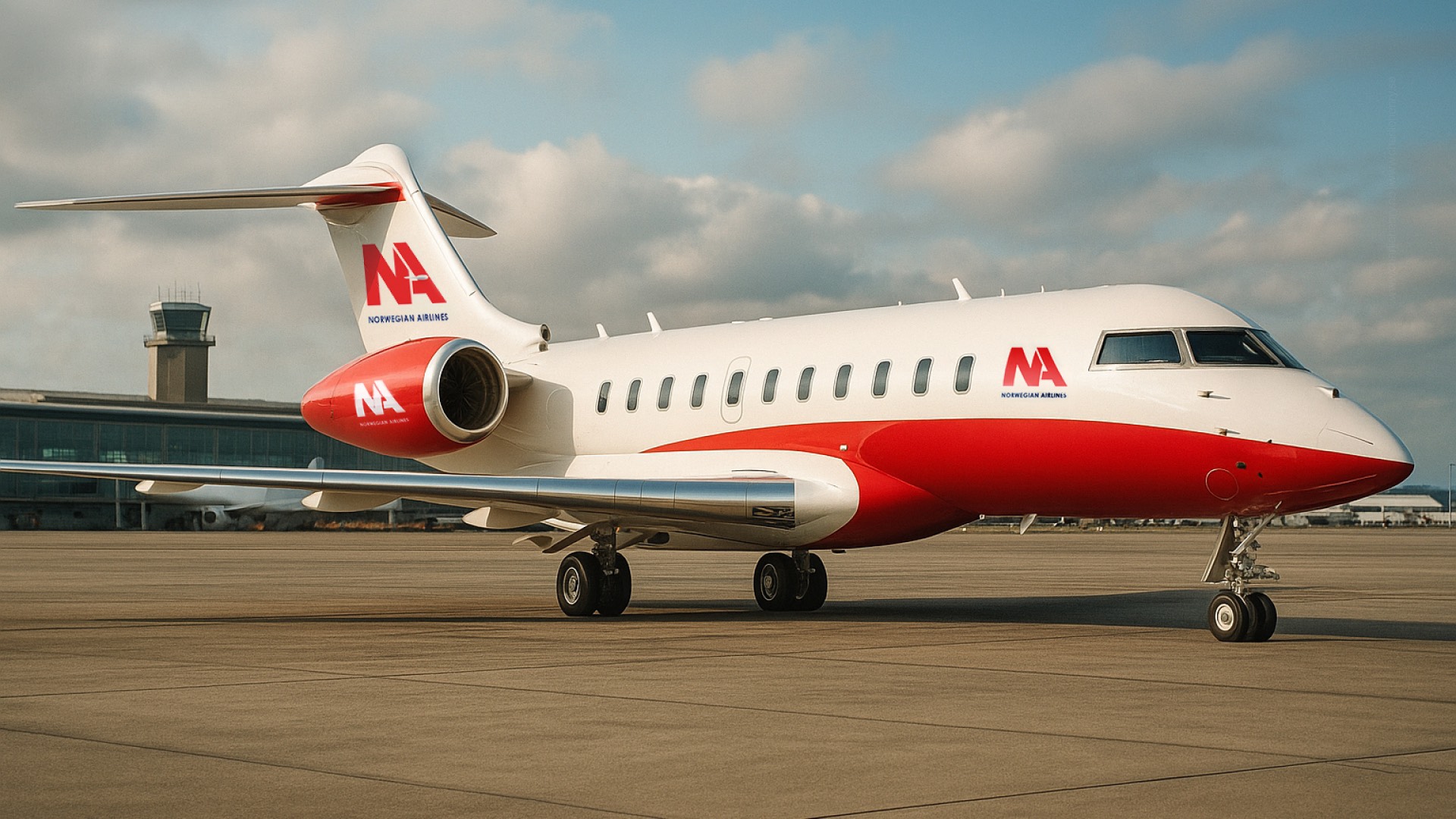
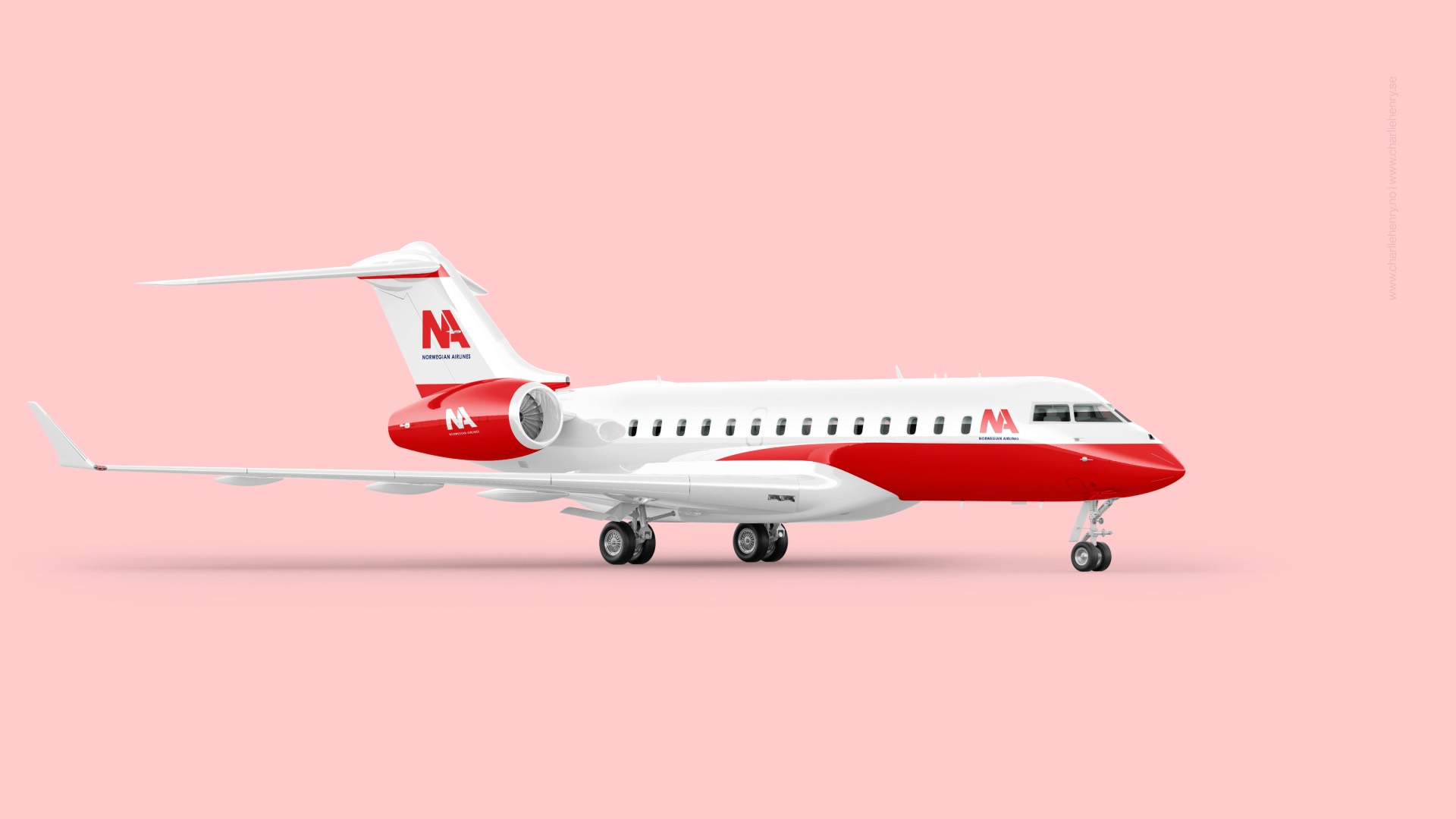
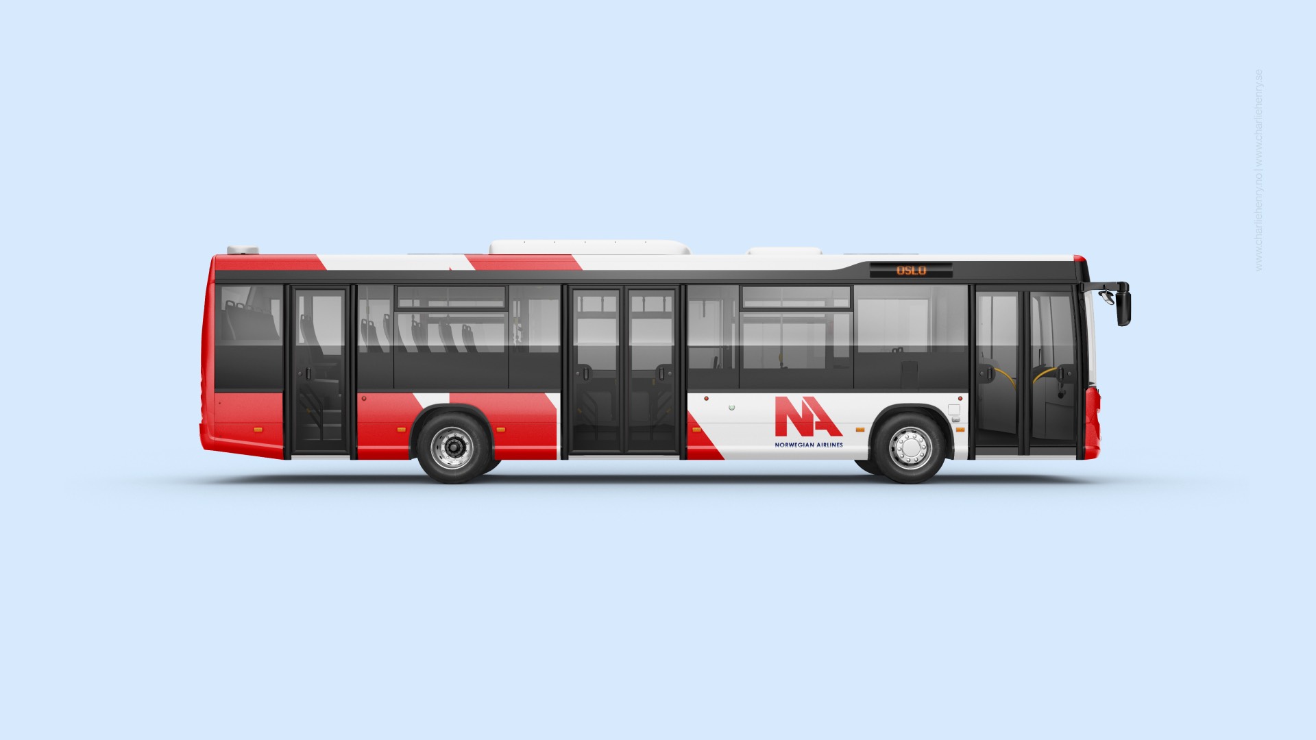
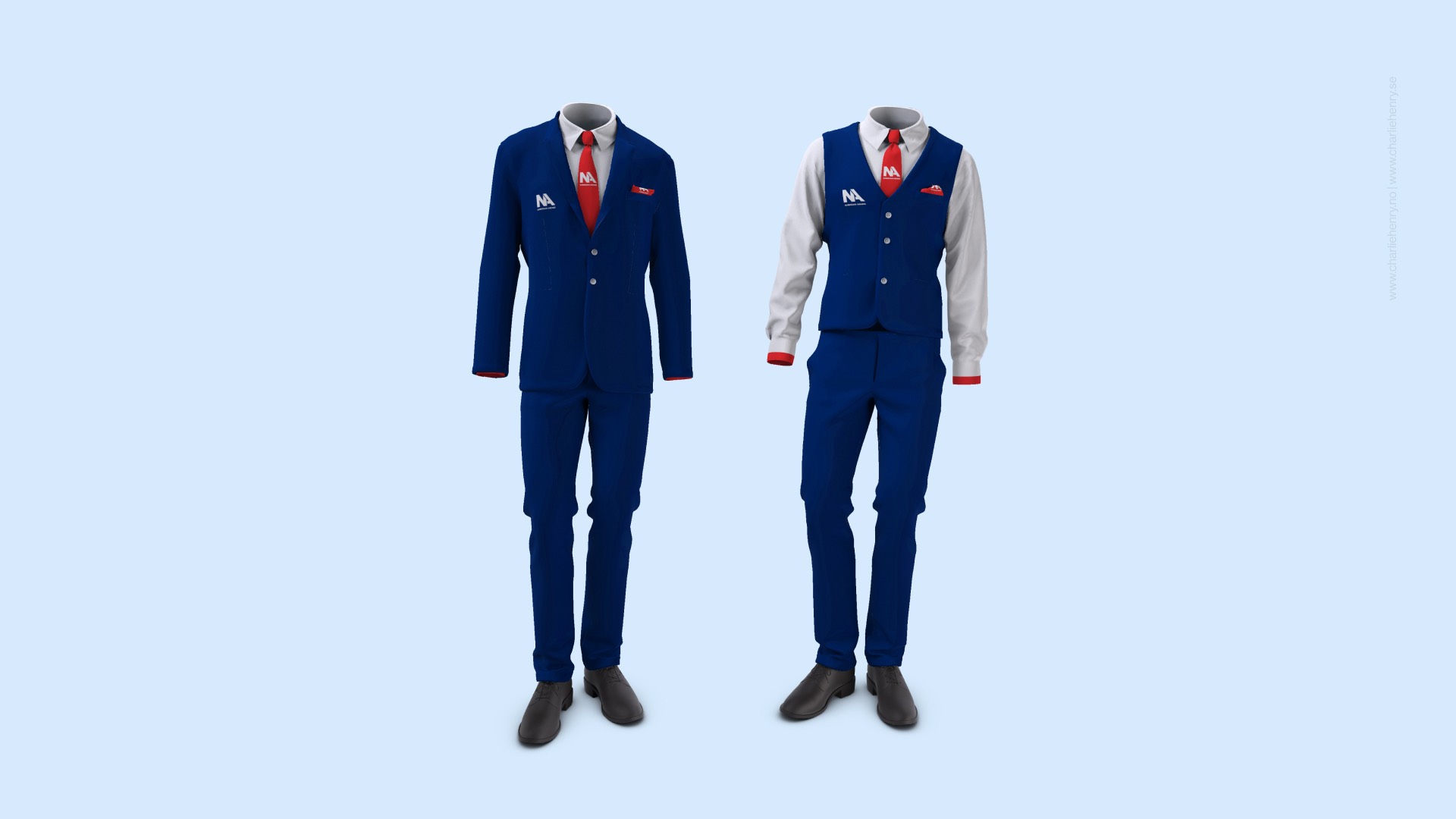
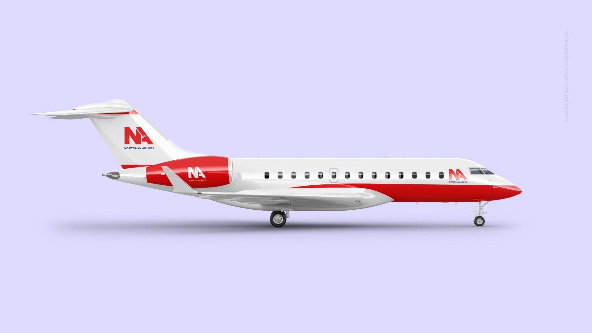
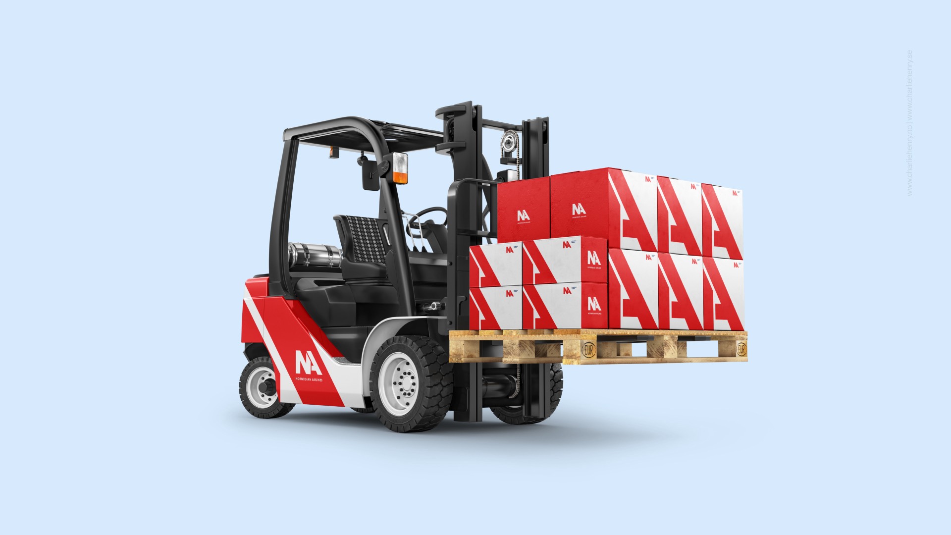
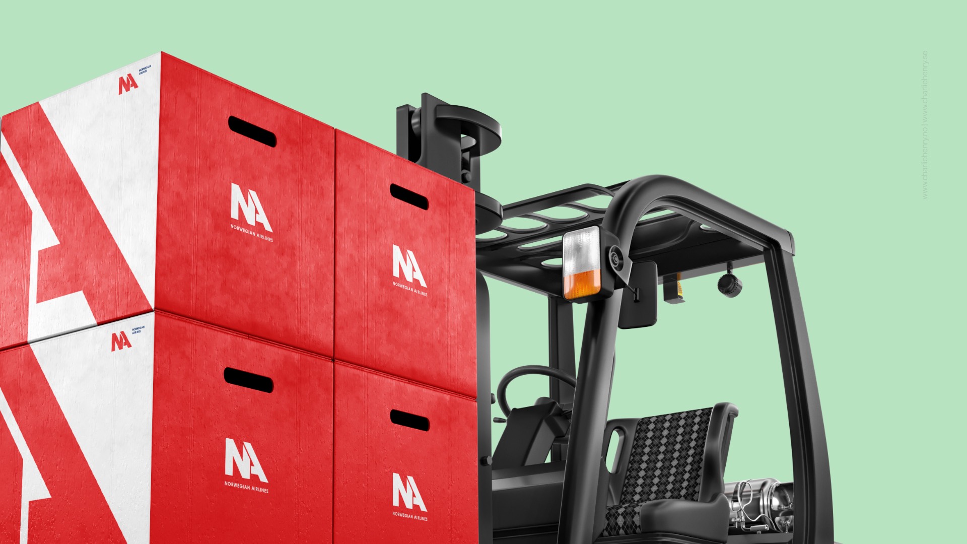
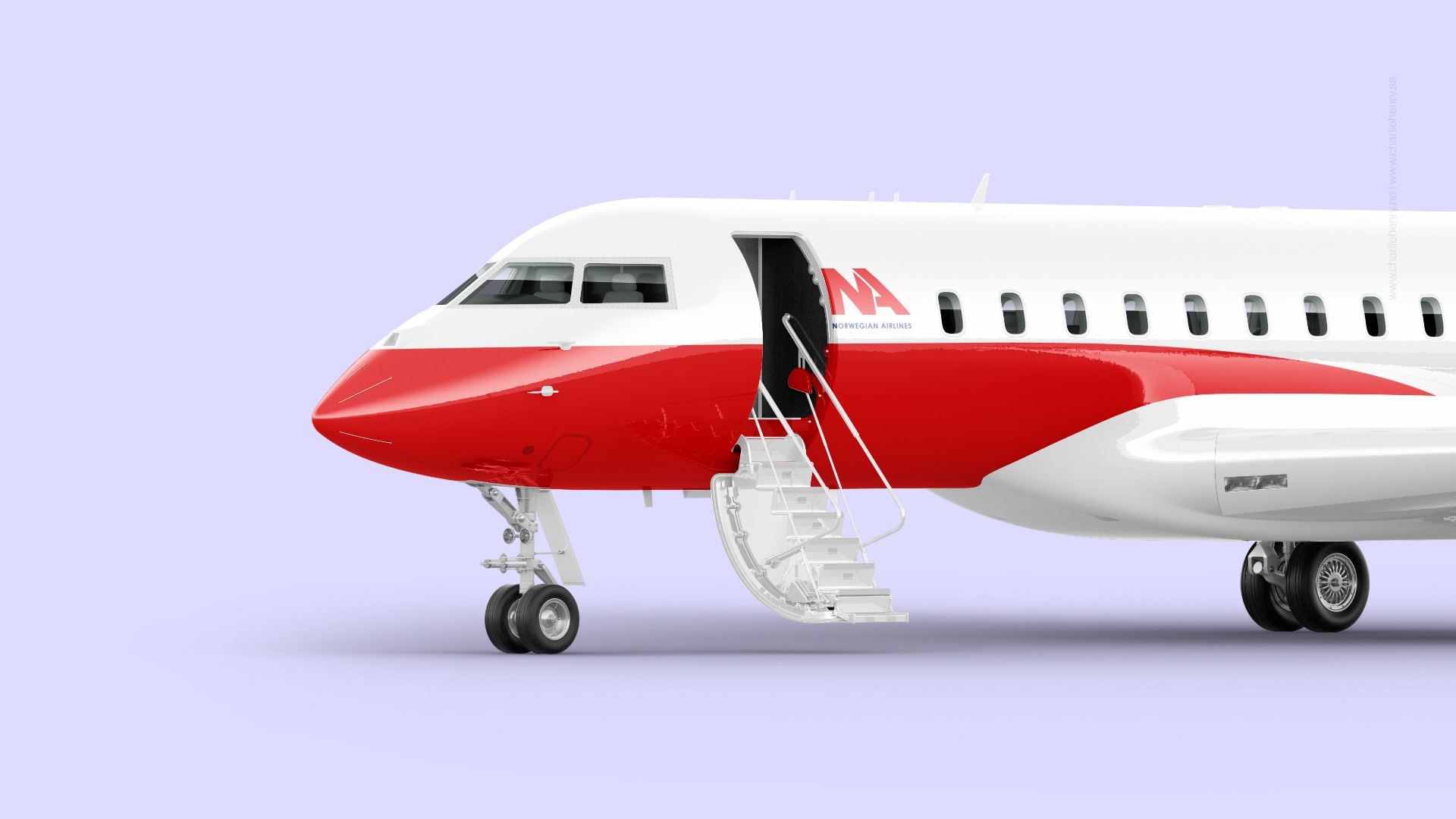
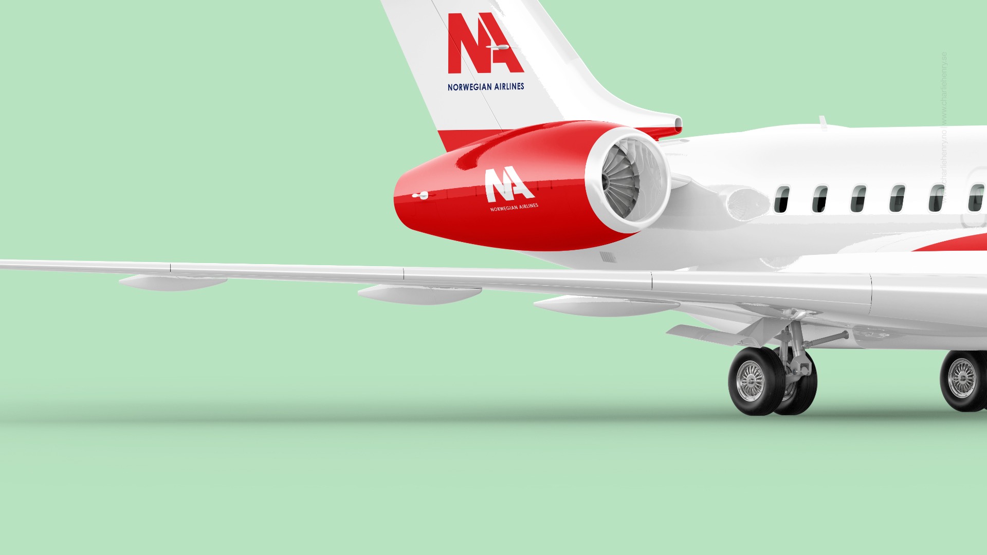
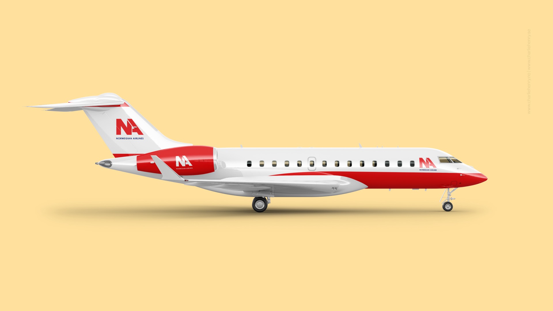
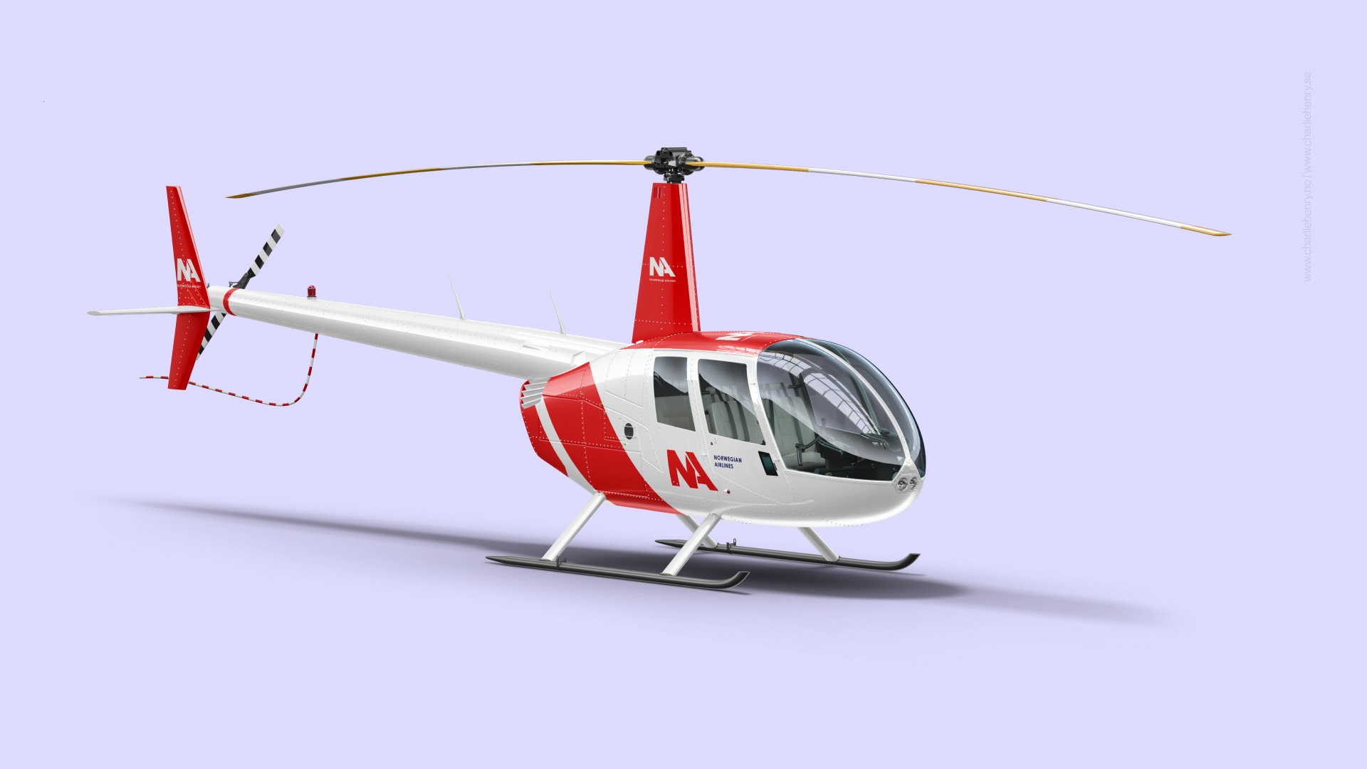
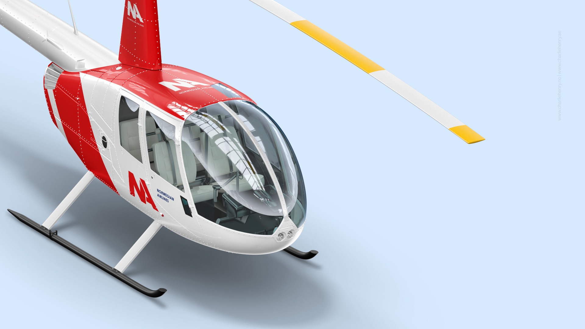
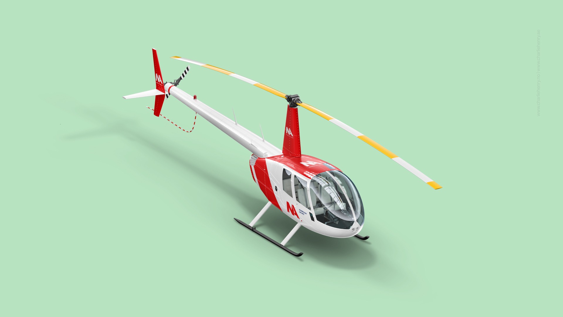
- Building 3D models of real aircraft elements to explore materiality and spatial presence
- Producing visual assets that communicated clarity, trust, and innovation
The design direction echoed the calm, functional beauty of Nordic design while introducing boldness for a global audience.
Result: The outcome was a refreshed brand toolkit that aligned internal teams and excited customers. The 3D visuals brought life to the brand’s future ambitions, positioning Norwegian Airlines not just as a carrier—but as an experience. It’s a foundation ready to grow across digital, print, and physical spaces.

“Scandinavian design isn't about decoration—it's about purpose, harmony, and a quiet confidence that speaks louder than trends.”
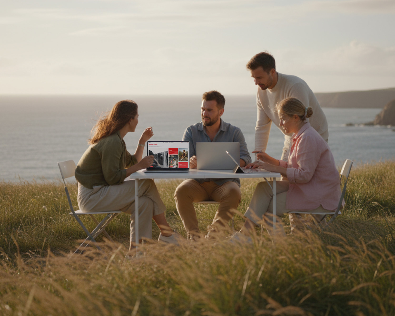
I love working with Scandinavian companies because they understand that design is more than visuals—it's a way of thinking. Norwegian Airlines challenged me to tell a story not only through branding, but through atmosphere. It’s rare to work on a project where every detail, from colour to curve, reflects a shared cultural mindset of clarity, trust, and innovation.
Explore more